PROBLEM
01
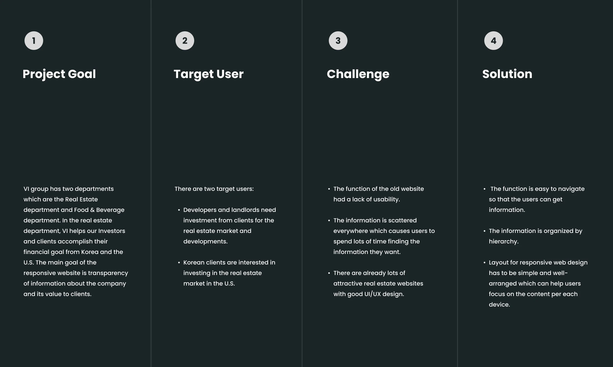
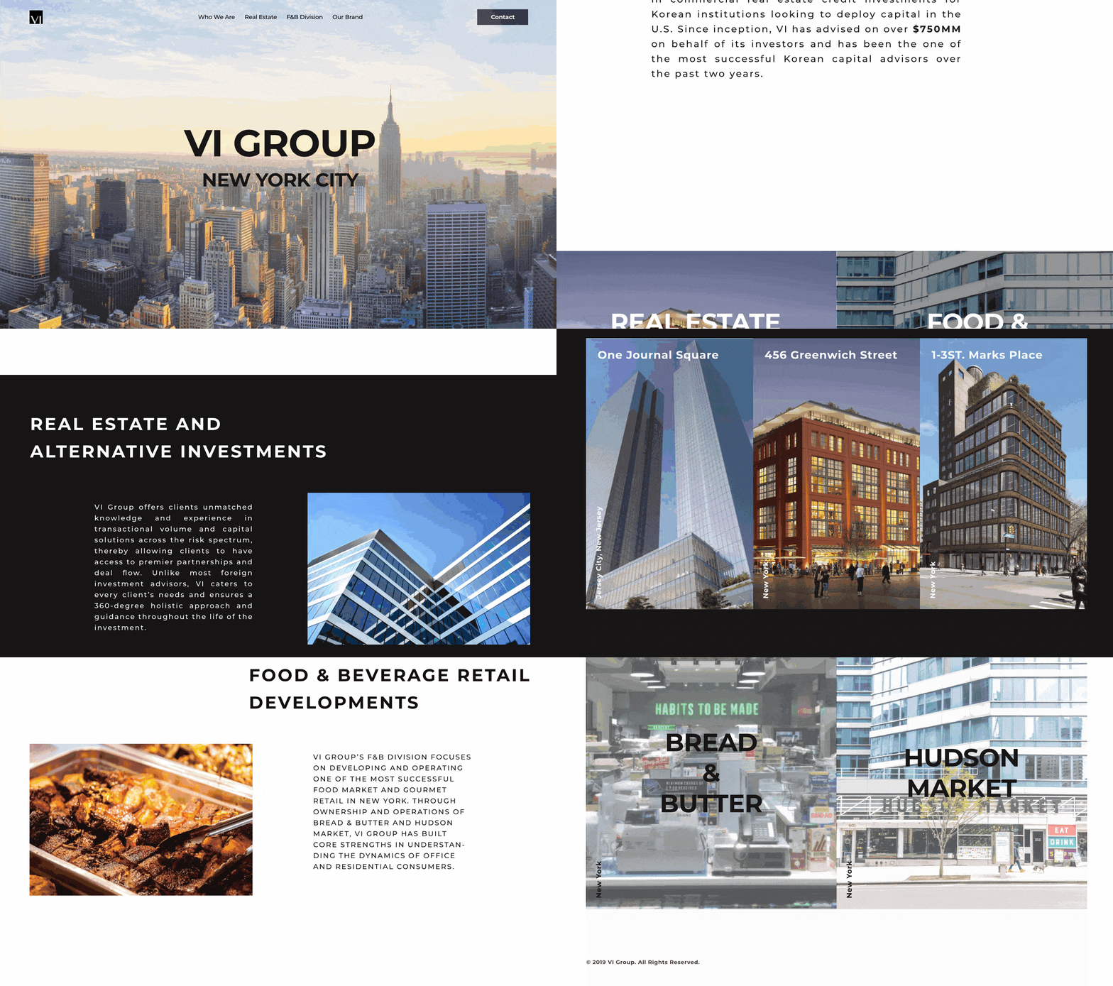
The function of the old website had a lack of usability as there was only a landing page.
02
The information is scattered everywhere which causes users to spend lots of time finding the information they need.
03
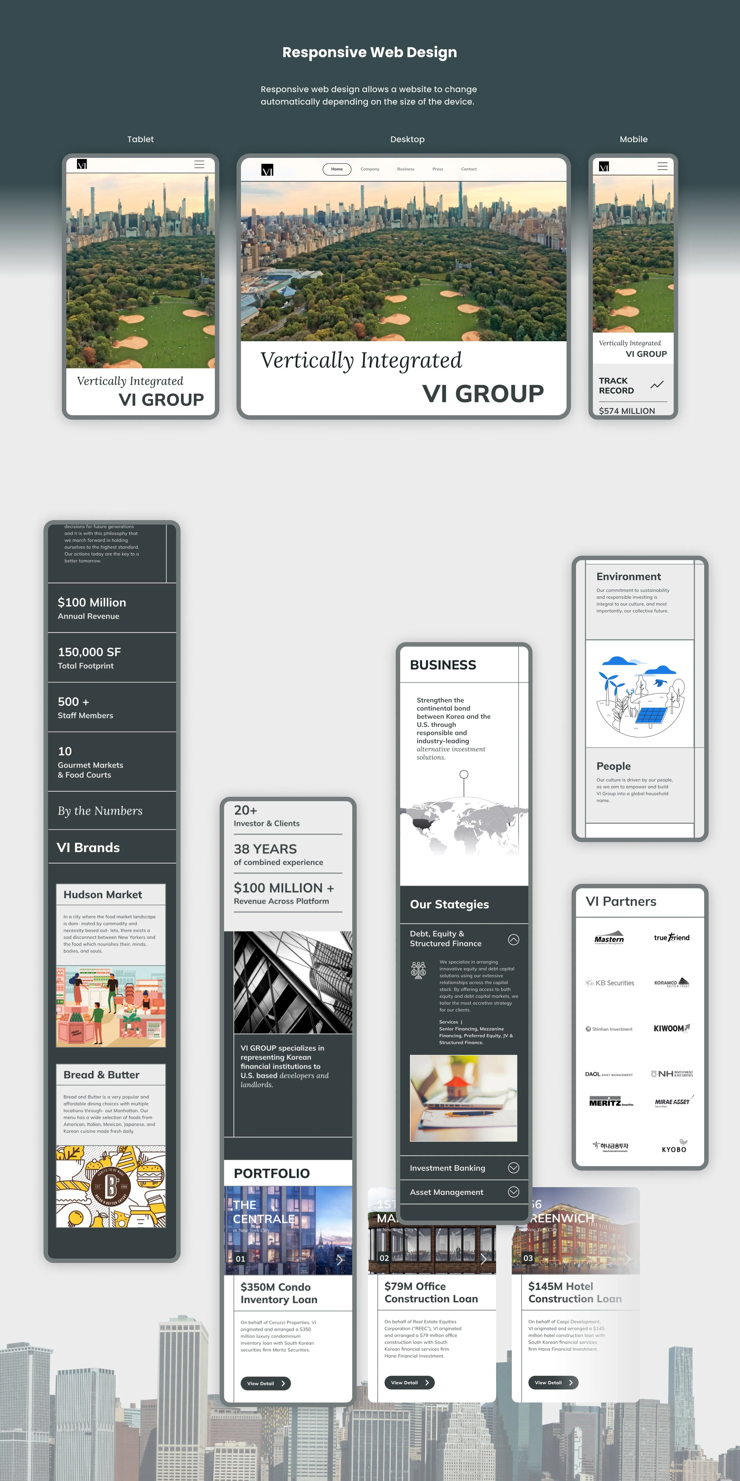
The design of the old website was not a mobile friendly layout.
Old. ver VI Group
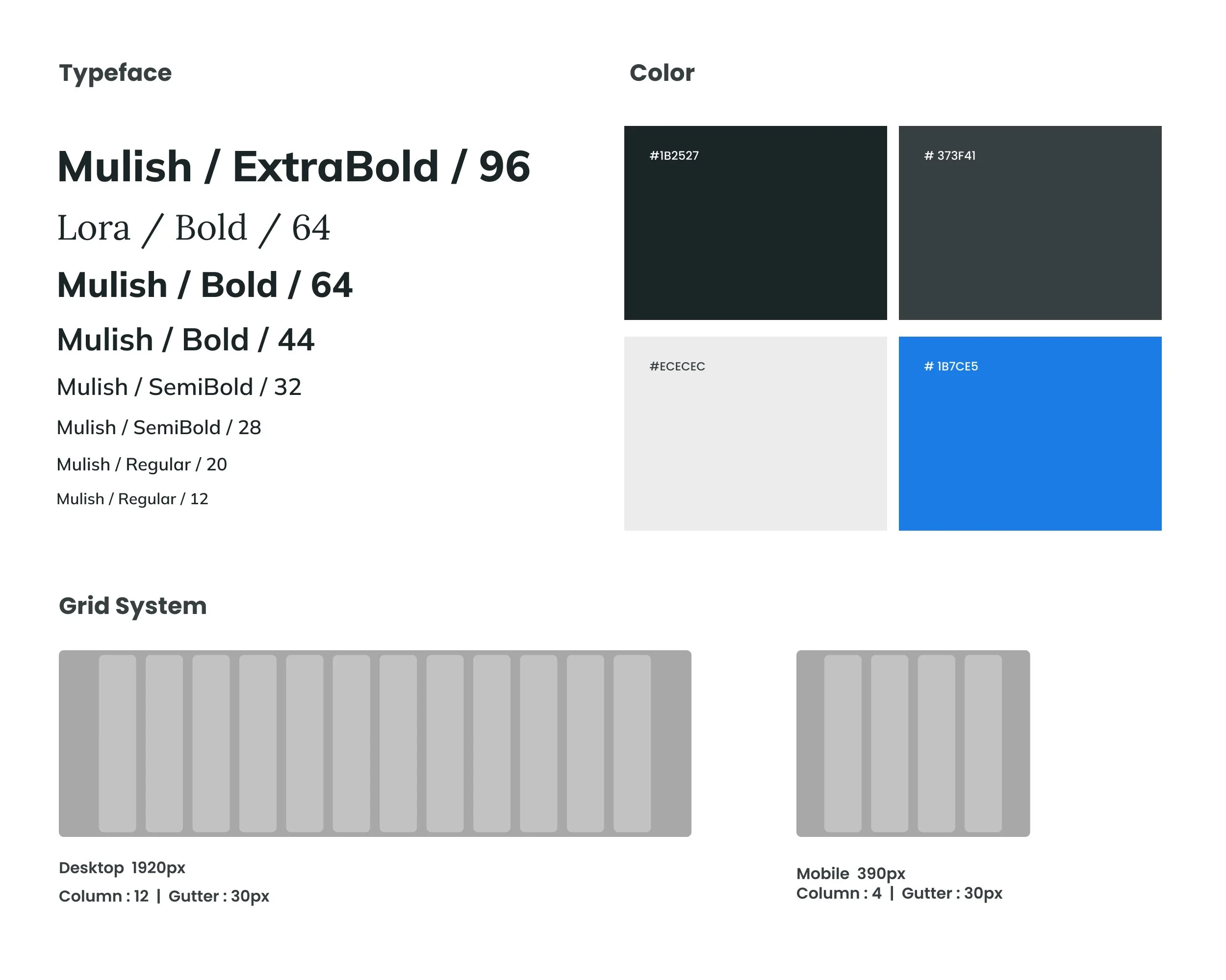
DESIGN SYSTEM

Takeaways
We gathered feedback from some users & stakeholders to improve the current design.
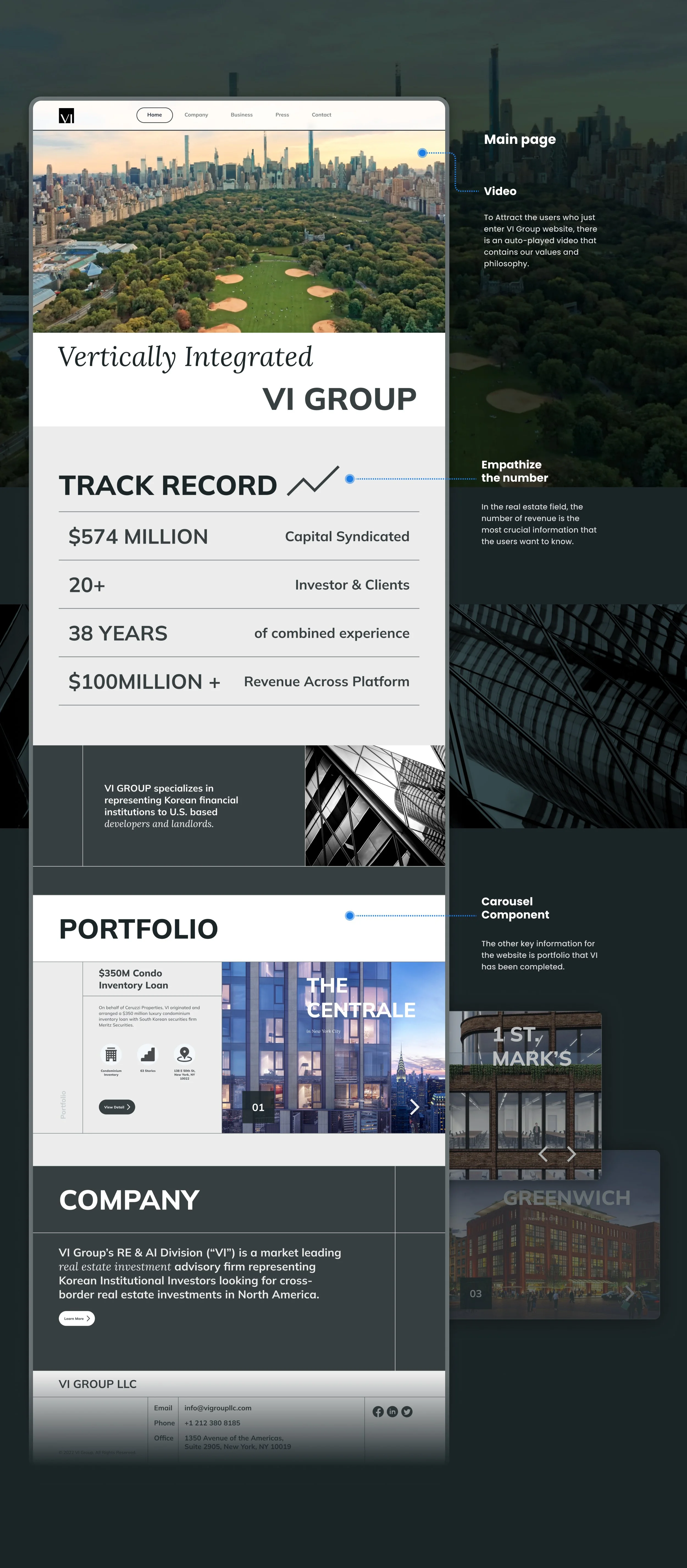
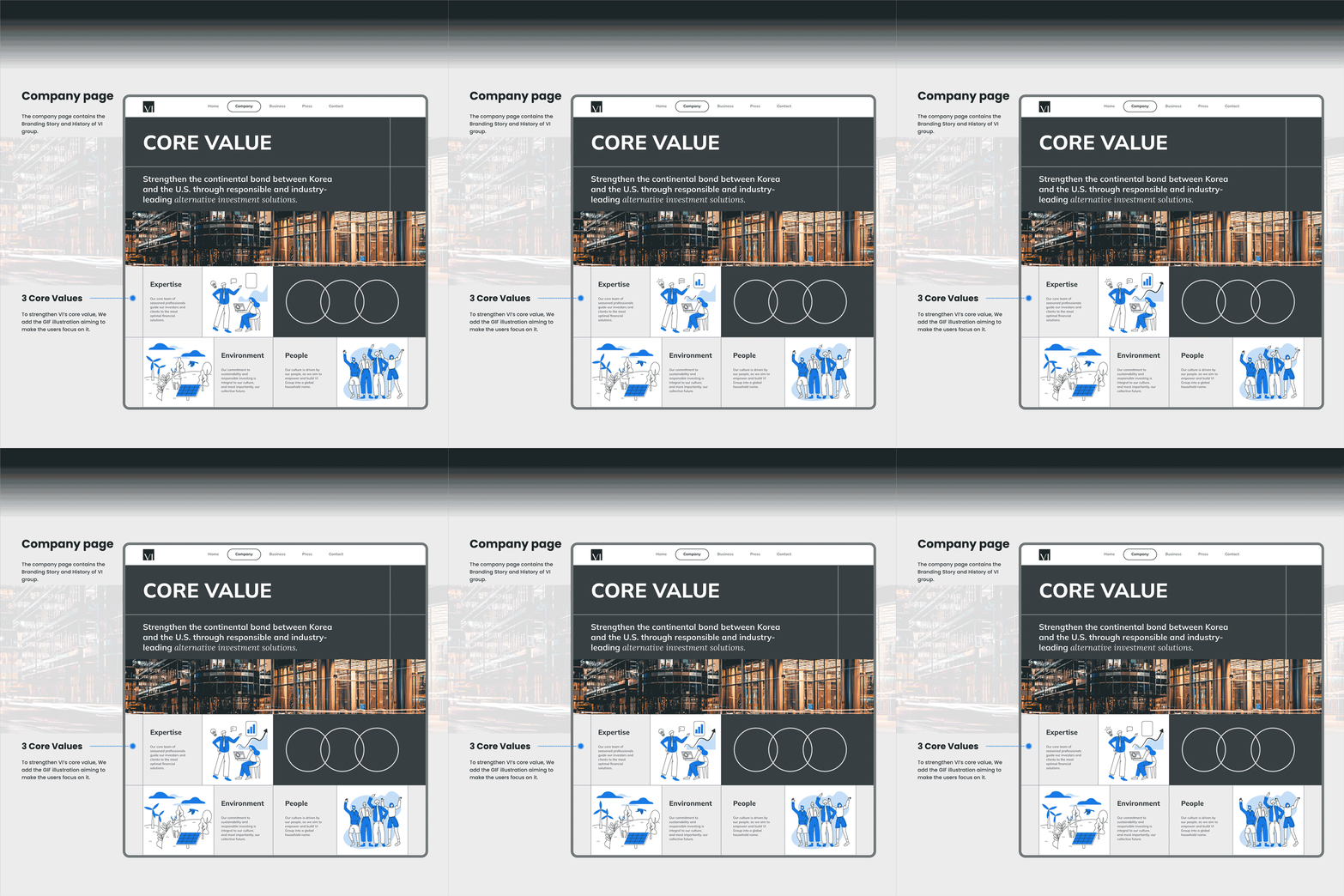
First, after meeting with stakeholders, we decided to change design with stronger brand identity in each layout.
CTA which is a button. As the current button is a similar color with other elements, the user struggles with finding it.
Press Page They felt frustrated about press pages which had long scrolls. The reason that we chose a long screen layout is because we assumed that users saw the articles organized by newest. It turned out that they wanted to see overall articles and choose one based on the headline.
CMS Systems : To efficiently manage content, I am planning to set up a CMS in Webflow so that any colleague can update content right on the page.
We successfully launched the website. As a result, VI was able to expand the connection with developers and financial institutions and finished another project in 2022. Even though the developer couldn’t finish this project with us, I gained experience from collaborating with the developer. From that, I learned the importance of clear communication to succeed in the project. I also had to check frequently and thoroughly if the website is designed by the wireframe that I shared. I also understand the importance of responsive design at the design stage. We iterated the design multiple times while checking the website on the different devices.
See More Of My Work:
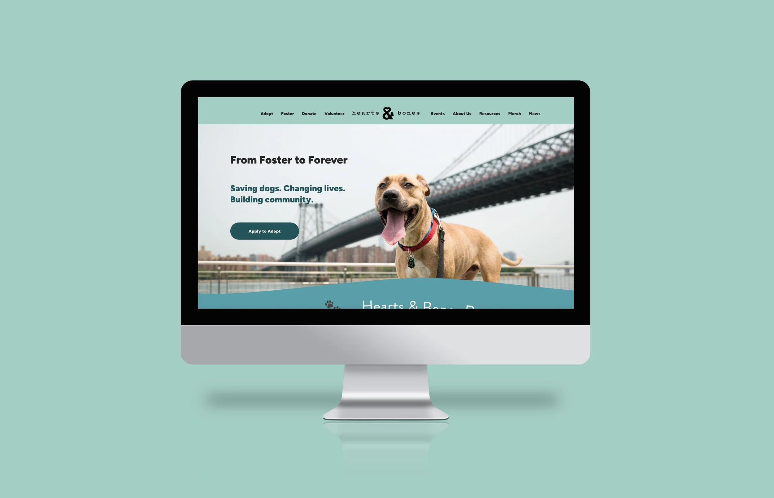
Hearts and Bones Website
Animal Rescue Organization • Web Design • Marketing
Responsive website for the organization to build up better user flows and make it easier for users to find information for adoption.
Sammy Sandwich
Food&Beverage • Design Guideline • Marketing
Branding/Digital design with new brand identity, design guideline for a consistency for In-house brand at Hudson Market.


