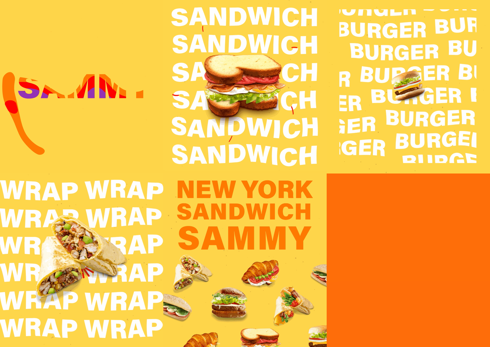
Sammy Sandwich
Overview
Sammy Sandwich shop is Hudson’s first brand in terms of Shop-in-Shop(“Food Hall”) concepts. Sammy Sandwich explores many types of sandwiches to provide lots of tastes for customers. We hope to give customers a joyful feeling by having our sandwiches and it is what our main goal and mission are. I wanted to help how the customer engages with the brand both digitally and in store.
My Role
Brand Identity, Logo Design, Package Design, Photography, Digital Content, Motion Graphics
Tools
Adobe Illustrator, Photoshop, Lightroom, After Effects
Industry
Food & Beverage
In-house Brand at Hudson Market
old logo & branding
new branding motion graphic (early ver.)
Concept - Logo & Color
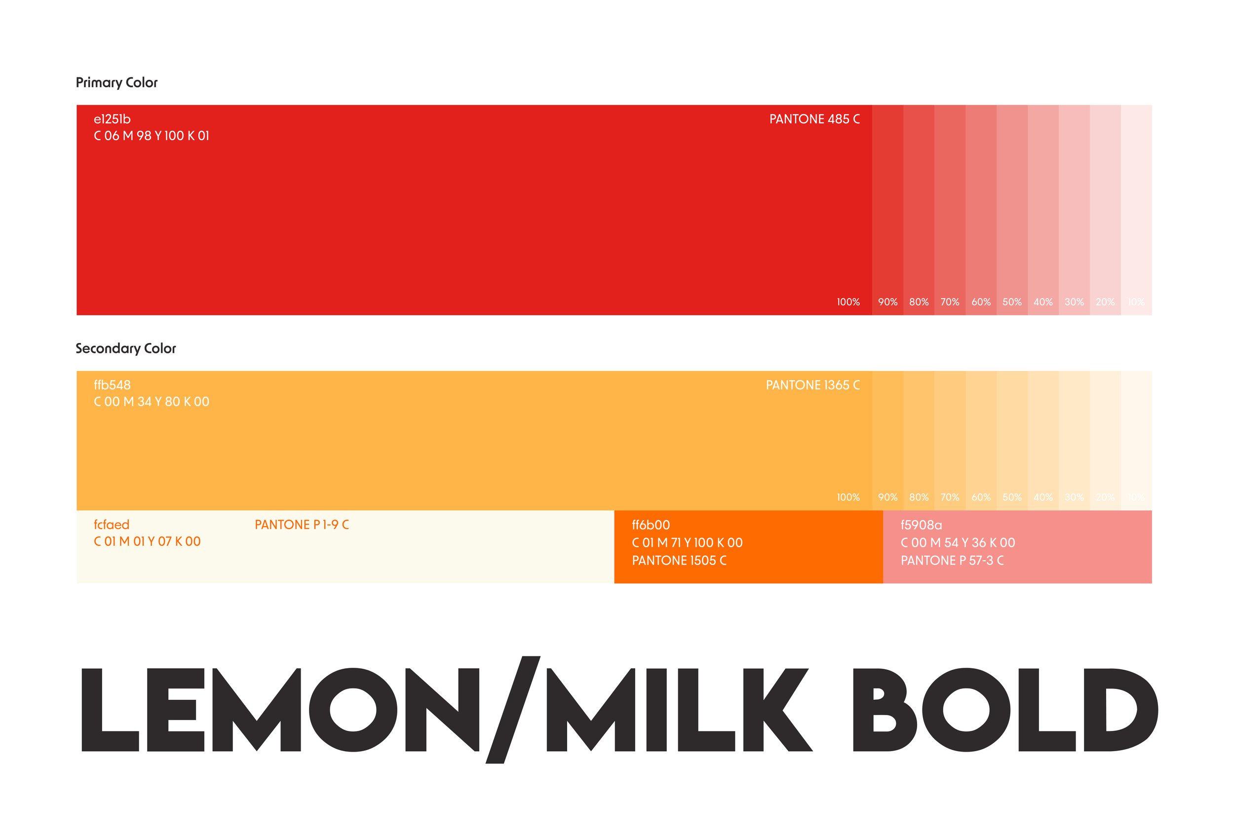
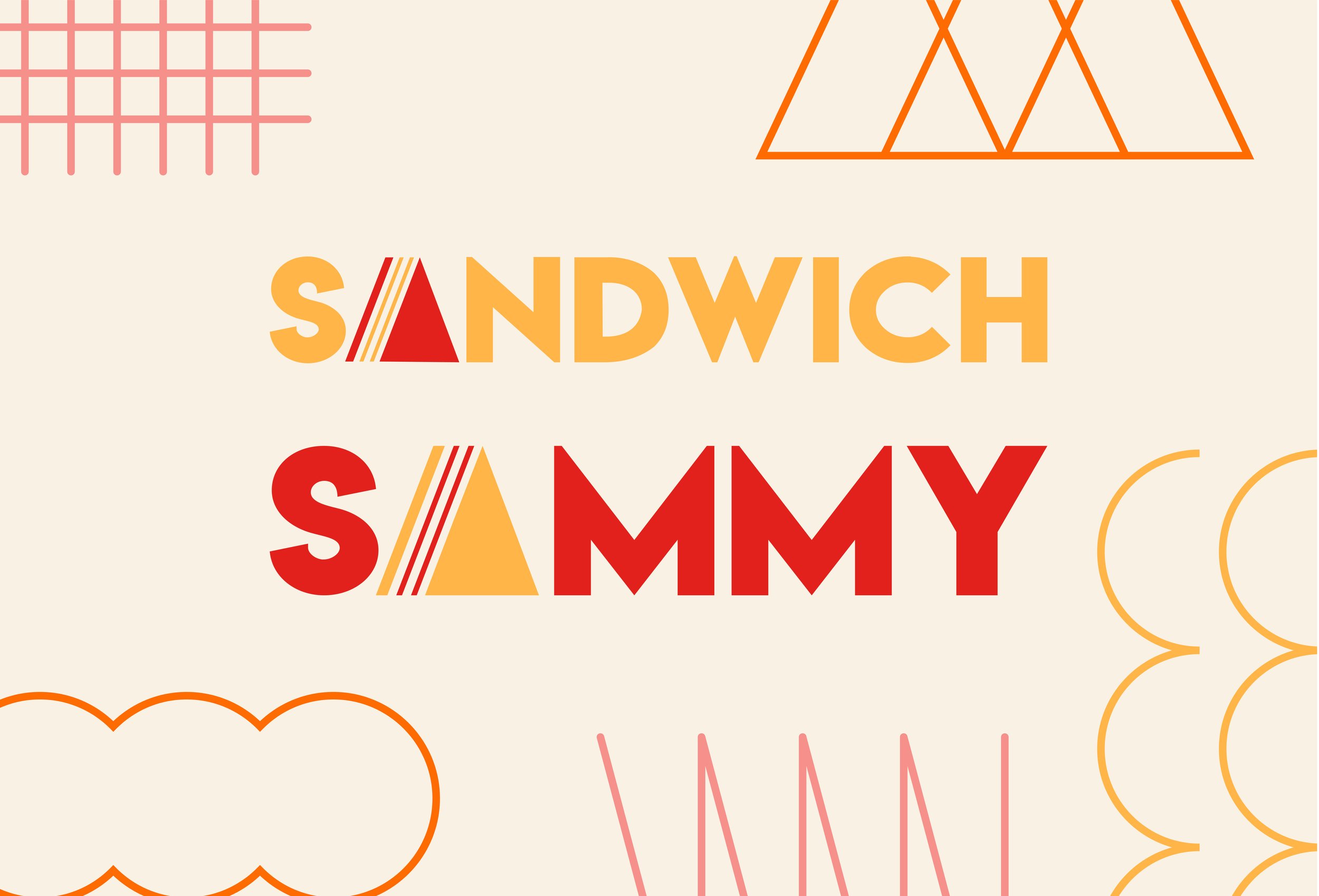
“Simple is the Best” is our philosophy. It means that it is all about taste and happiness. To emphasize this philosophy, I wanted to use a simple color way red & yellow combination. Through intuitive fonts and patterns of shape, the brand identity can represent the concept of Sammy Sandwich Shop so that we can inspire customers to live an enjoyable life.
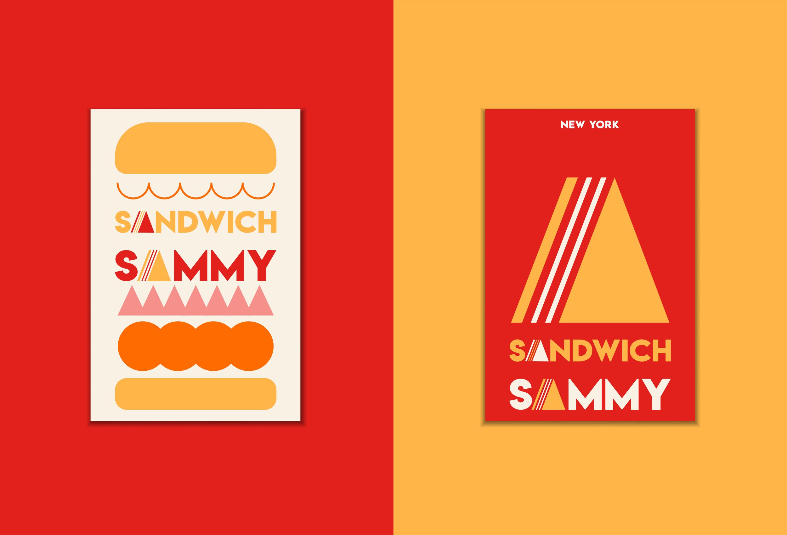
With the same concept of color and font, I would like to utilize the basic and intuitive way to make the logo. By adding the sandwich shape instead of the letter “A”, customers can easily understand what kind of business is serving them. There are two lines in the logo of the sandwich shape. They are the symbolic elements that express our two keywords “Taste” and “Happiness”. The logo always reminds us that pursuing happiness should be accessible to everyone.


Digital Design & Photography
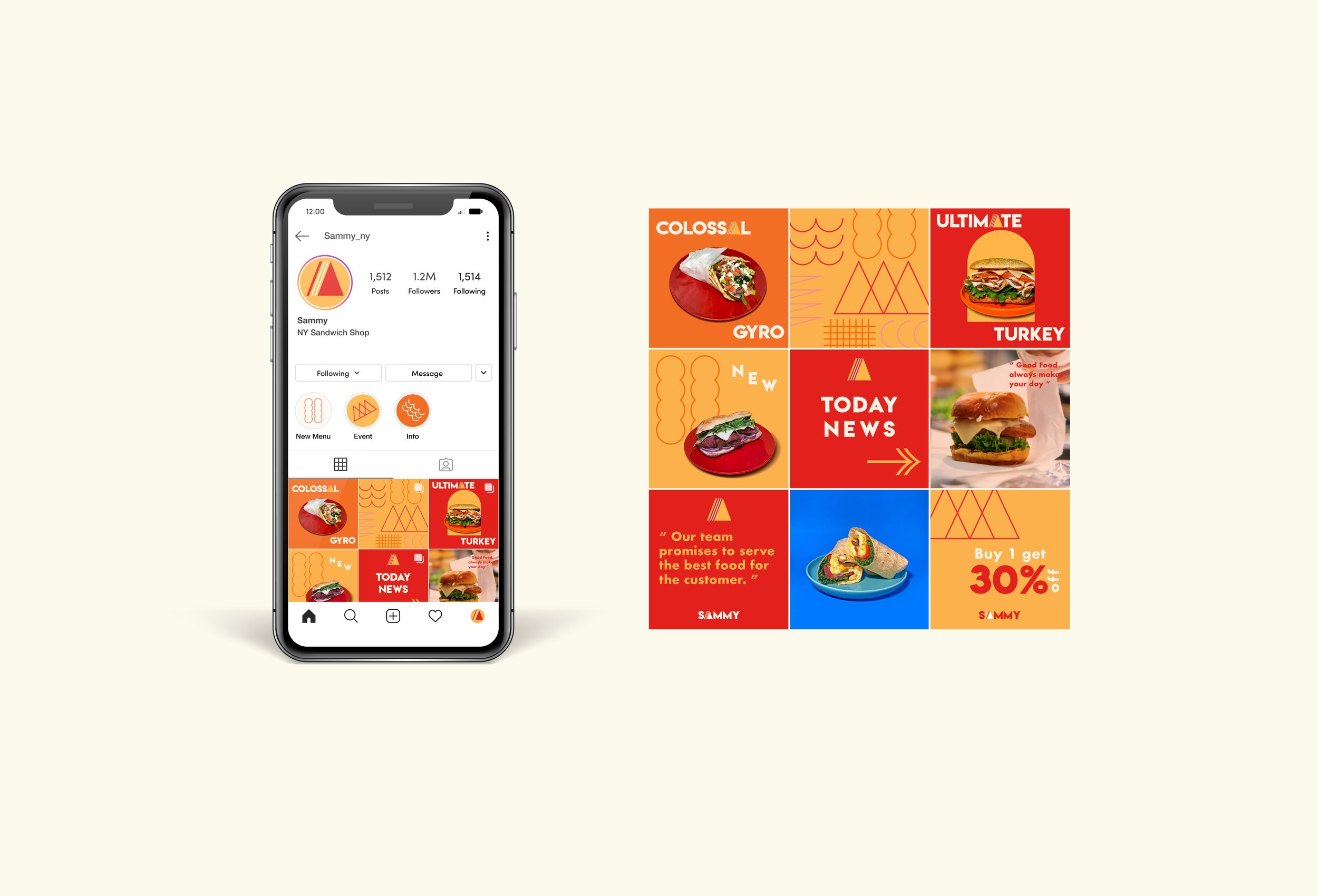
One of the challenges we faced was the lack of information that the customers wanted. When it comes to ordering food, we found that many people rely on photos while choosing the menu, especially on online platforms. At that time, We had not enough time / budget to hire any freelance photographer due to the timeframe that we scheduled. Due to this circumstance, I suggested the photoshoot by ourselves. After getting confirmed by the stakeholder, I was able to team up with our internal team to plan and proceed with the photo shoot for Sammy. The colorway of the background and plate are representative of the brand identity.


See More Of My Work:
VI Group Website
B2B • Web Design • End-to-End • Marketing
Responsive Website Design for Vi Group helps the users get information about the company and their portfolios.
Bop Haus
Food&Beverage • Design Guideline • Marketing
Create the branding design and story from ideation to launch for Korean comfort food brand, Bop Haus.


