OVERVIEW
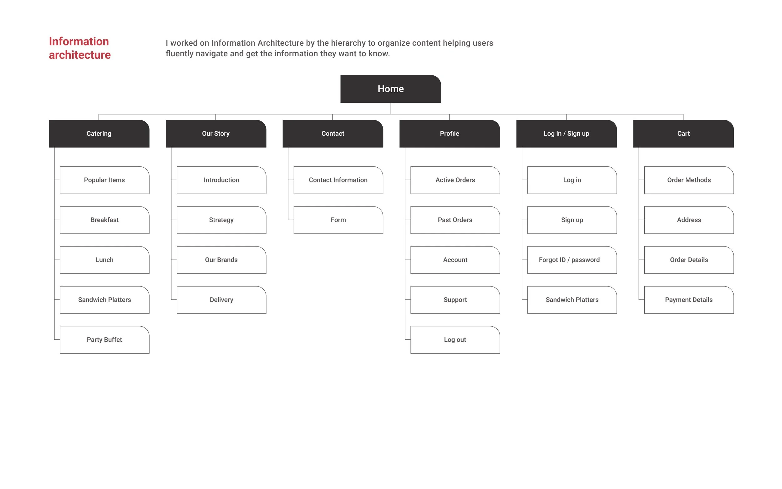
Hudson Market is a marketplace that offers a wide variety of cuisines and selection food items for customers. They have different food stations as well as other miscellaneous items and housewares so that customers can experience Hudson Market’s products everywhere. Hudson Market’s website wants to be user-friendly and has features such as the catering ordering system that allows users to easily order large quantities of items.
PROBLEM
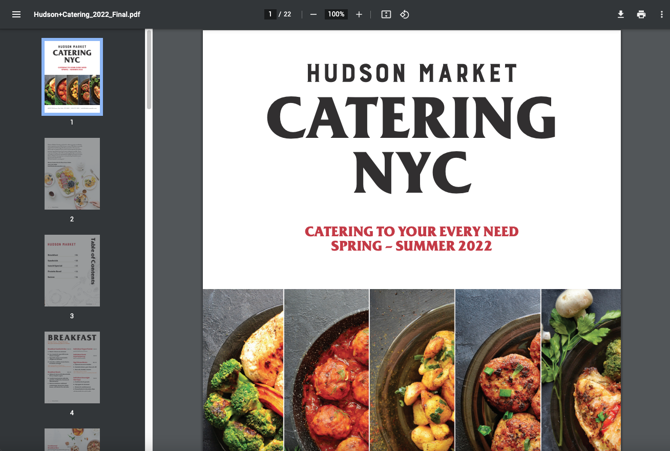
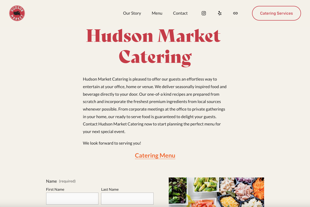
Originally I was tasked to rebuild the company website and update the PDF file for the catering menu so that customers were able to find the information regarding it. And I’ve noticed that the users need to ask for a quote and wait for the response. Even though the catering service was one of main services at Hudson Market, it was not easy to use.
01
Inconvenient Ordering System
With the current website interface, the user needs to ask for a quote and wait for the market respond.
02
Lack of Information
The current menu isn’t organized by occasions or cuisine, and makes no mention of dietary restrictions or allergy information.
03
No Order Tracking
There is currently no way to track the order after it’s been placed, which can lead to confusion when coordinating delivery.
HM Website’s main challenge is no catering ordering system.
“How might we make placing online catering order as easy as possible?”
RESEARCH
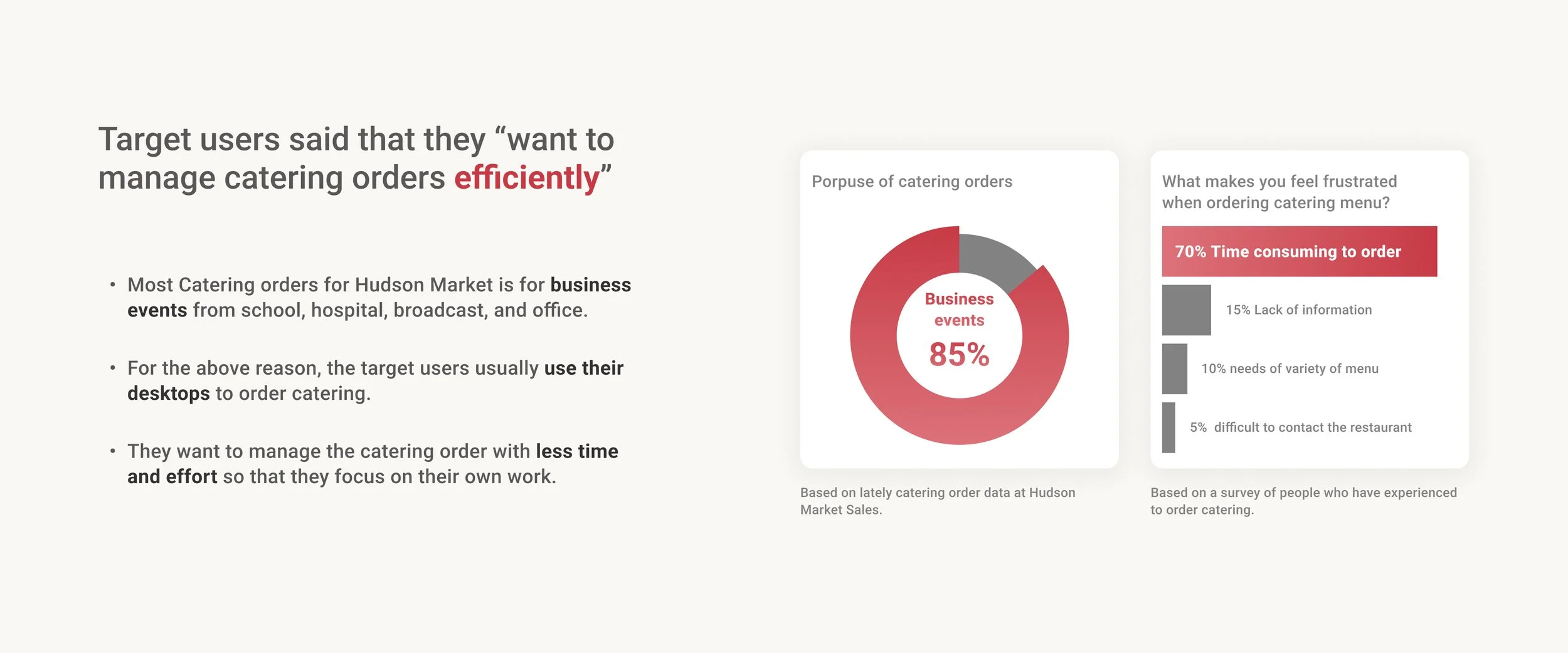
First, I wanted to empathize with users and their experience through the research. I conducted the survey for quantitative research with people who have experience with catering or large size orders. In terms of catering service, most people need it for business events at work.
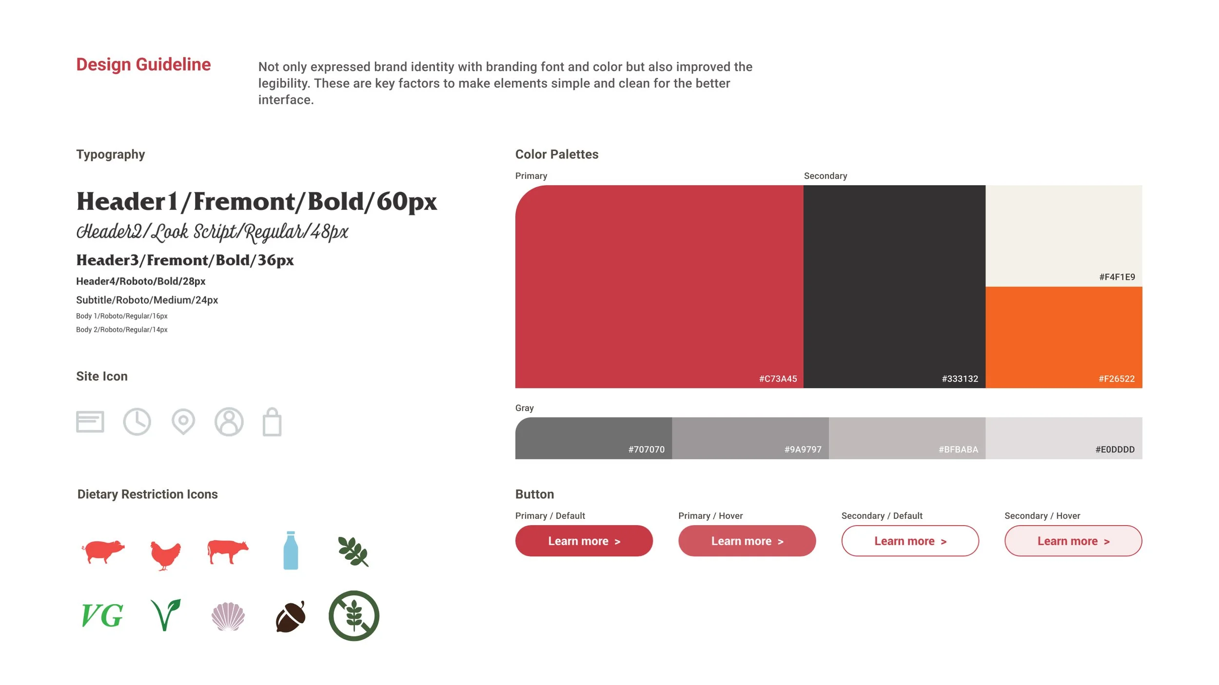
After that, I wanted to analyze the current Market to explore what was successful and could be improved. I analyzed the three popular brands with catering websites and one catering ordering platform. i mainly focus on the user flow to see the items on the menu pages and add it to cart. Plus, I explored the payment flow if there is anything that could be improved. Overall I found that They had no dietary restriction signs.
USER JOURNEY MAPS
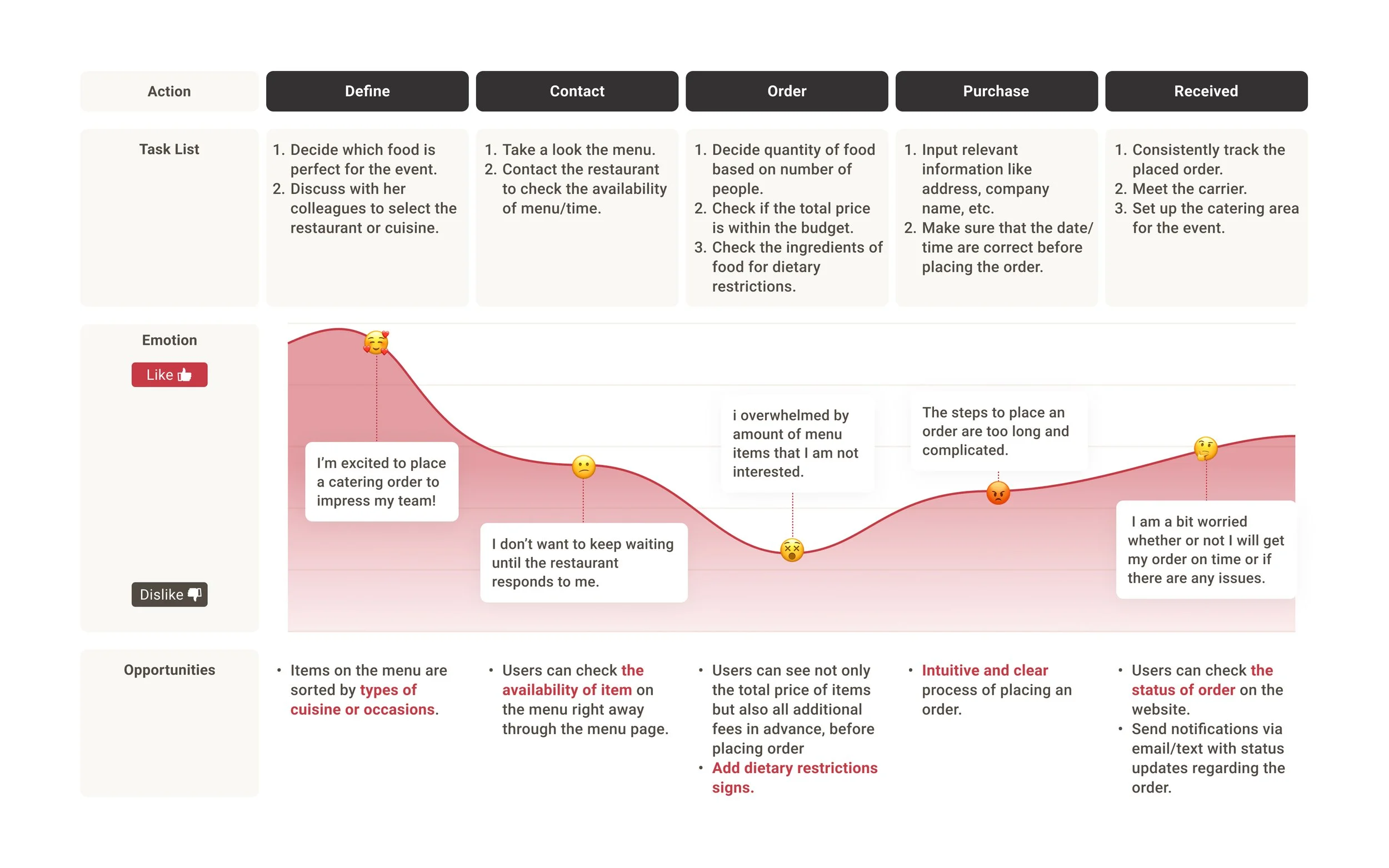
To Understand user’s emotion and to find the opportunities for more improving user experience, I built User journey maps of the Persona, which are visual representation of the actions a user takes to achieve a goal.
Scenario : For an office event with clients, Rebecca needs to order catering.
Goal : Successfully receive catering items and make sure everyone feels satisfied with the food.
INSIGHT & SOLUTION
After creating the Persona, User Journey Map, I built User Flow from finding a menu to complete the catering order process. From collecting data on each step in the user flow, I was able to find the three major Insights which allowed me to ideate the solution that would be adjusted in the design.
USABILITY TEST
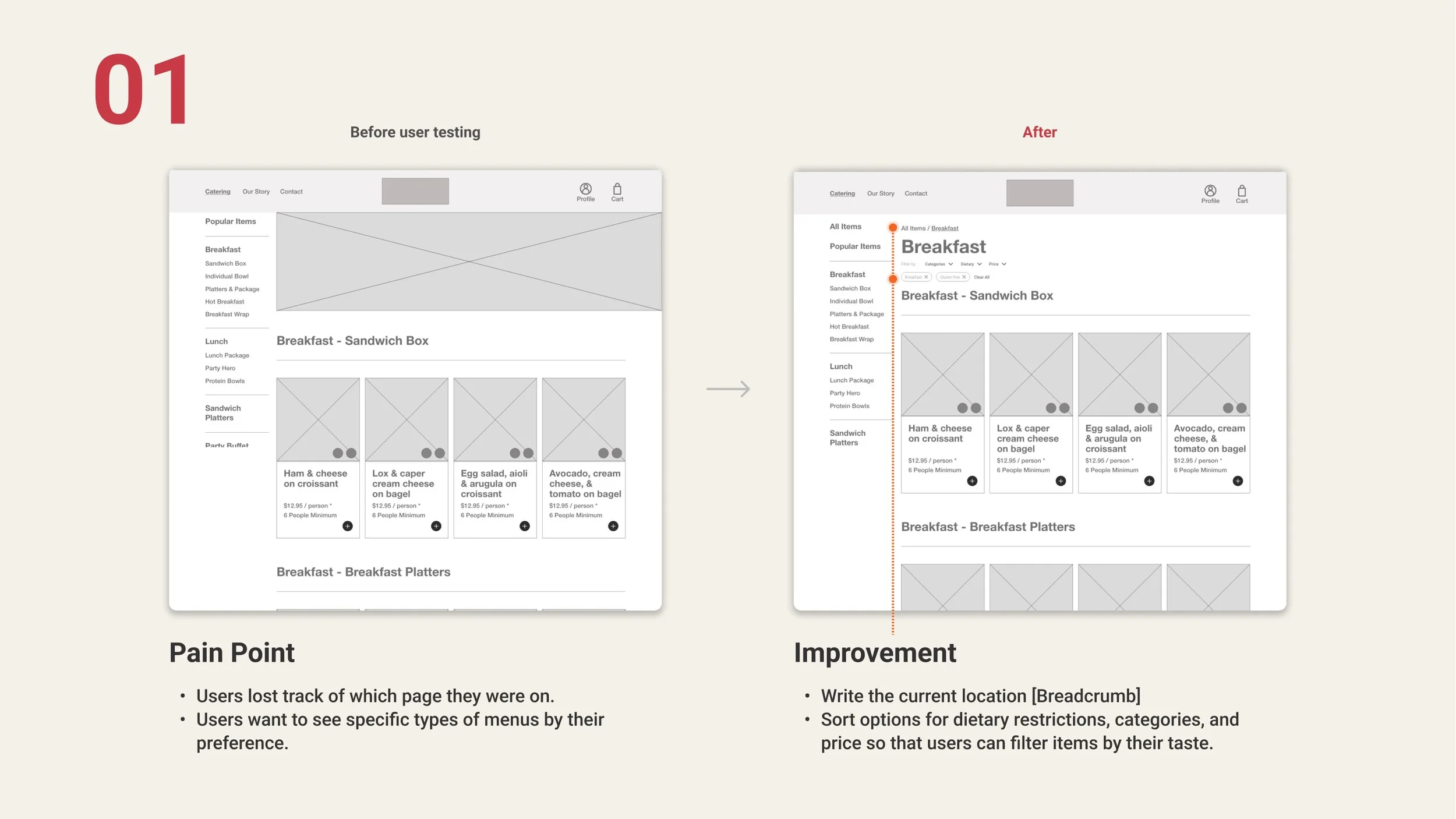
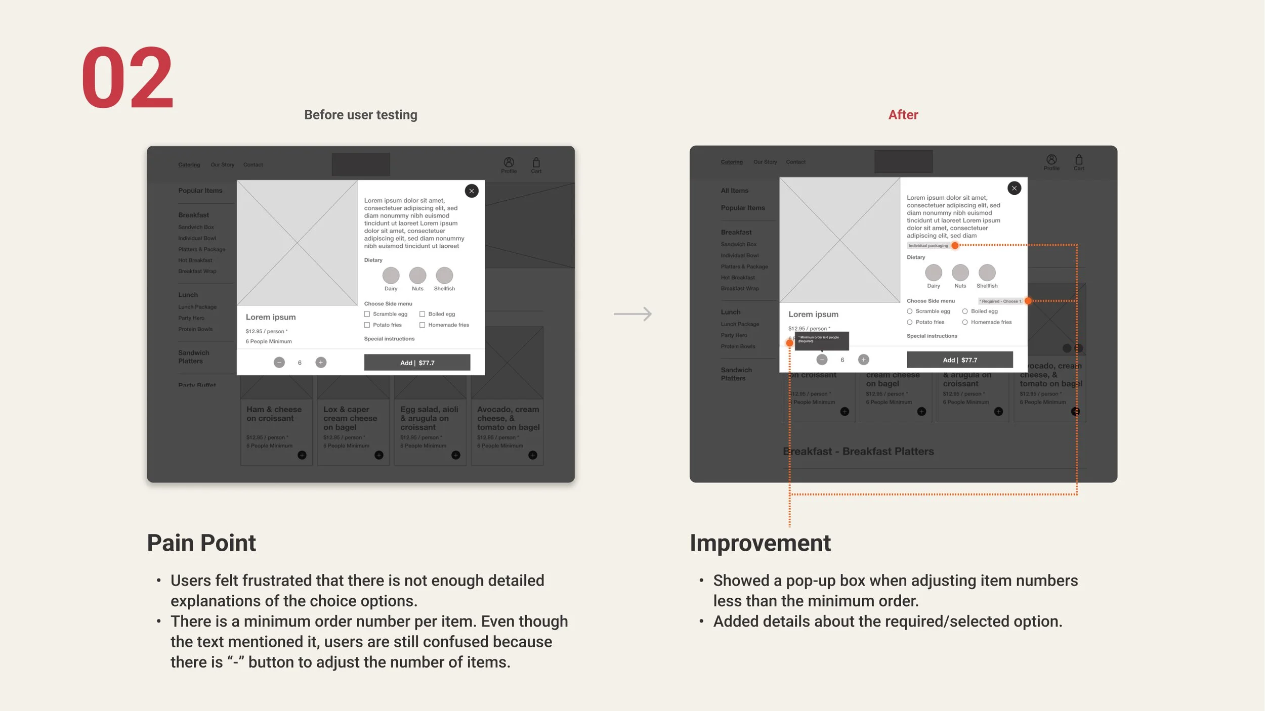
To validate my ideas for the solutions, I conducted 2 rounds of Usability tests with 5 participants. The purpose of the usability test is to find a better user flow for online catering order. As a result, I found some pain points and improvements to make the user experience better. There are 4 major improvements:
01 User Goal :
Find menu page, add the items to cart , and place the order.
02 Tasks:
Prompt 1. Go to the catering menu page and find breakfast menu page.
Prompt 2. Click a item on breakfast menu and add it to cart.
Prompt 3. Go to the cart page and complete to place the order.
FINAL PRODUCT
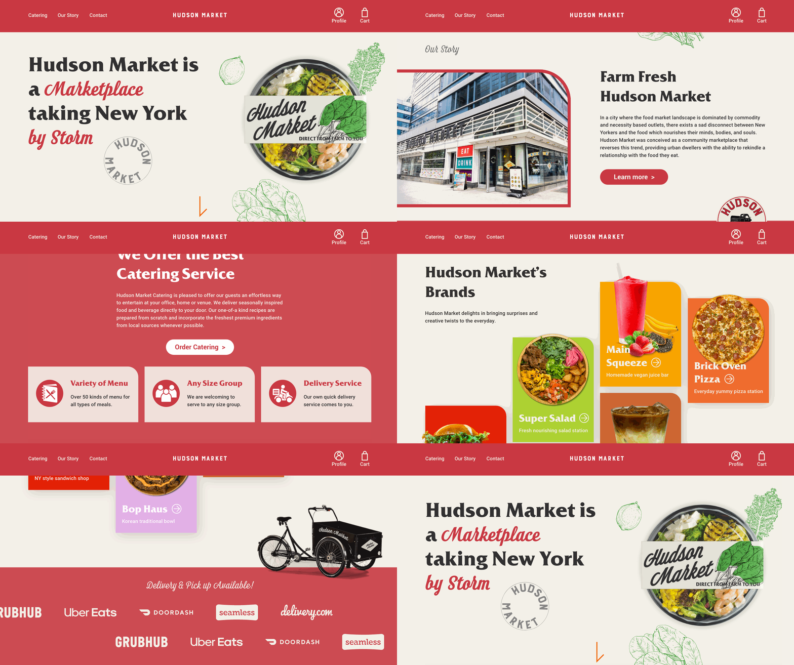
Hudson Market Landing Page
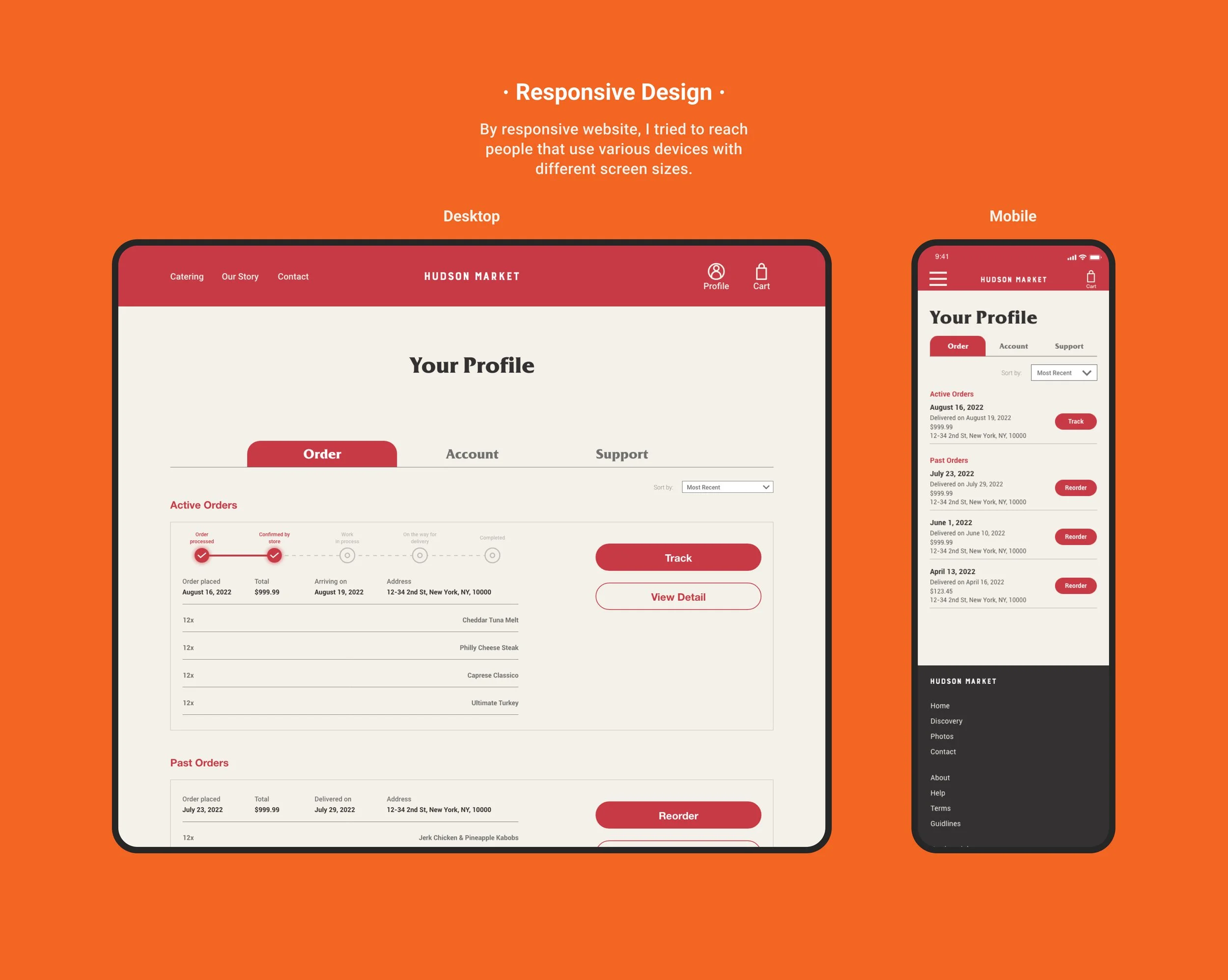
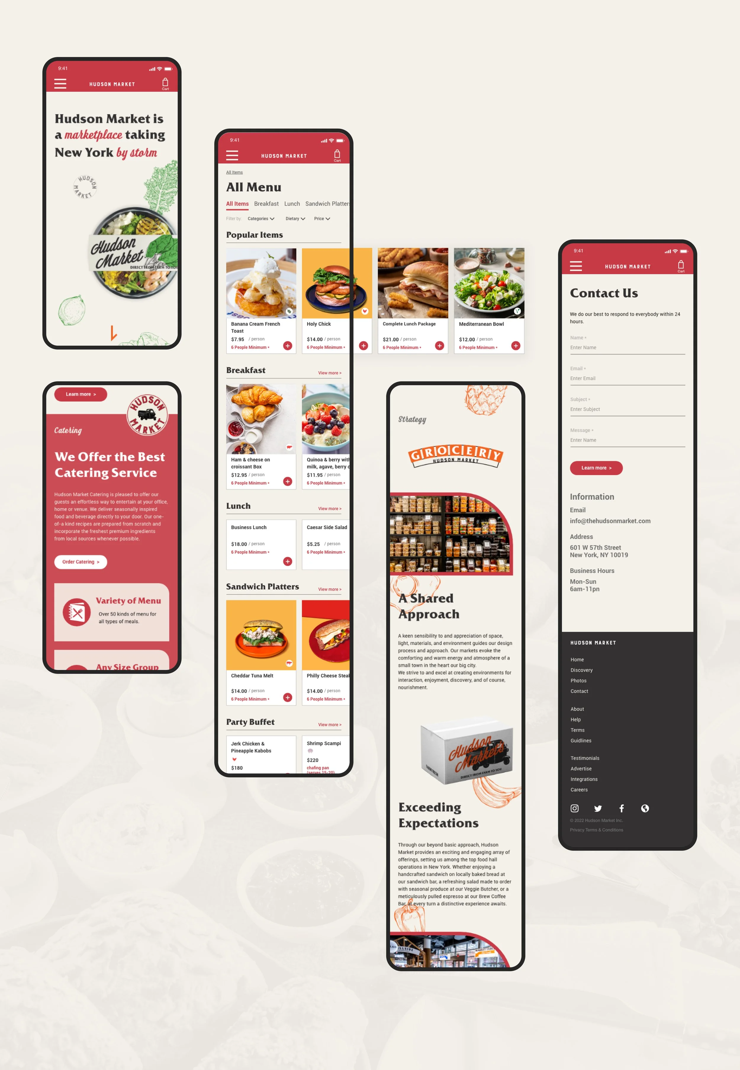
On the landing page, it encourages users briefly browsing the overview of the features. they can also access Button to enter other page such as Catering, our story, our brands, etc.
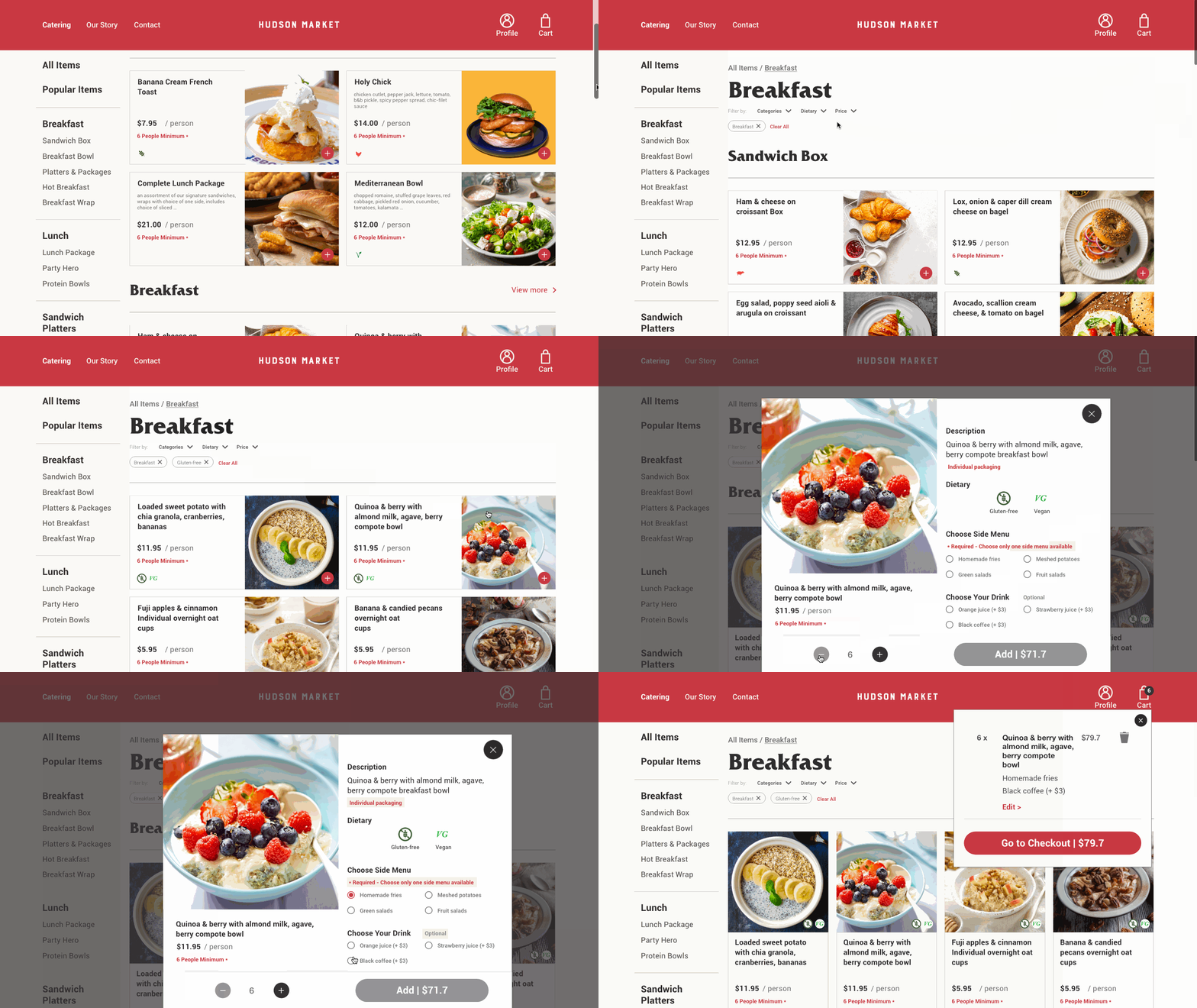
Catering Menu Page
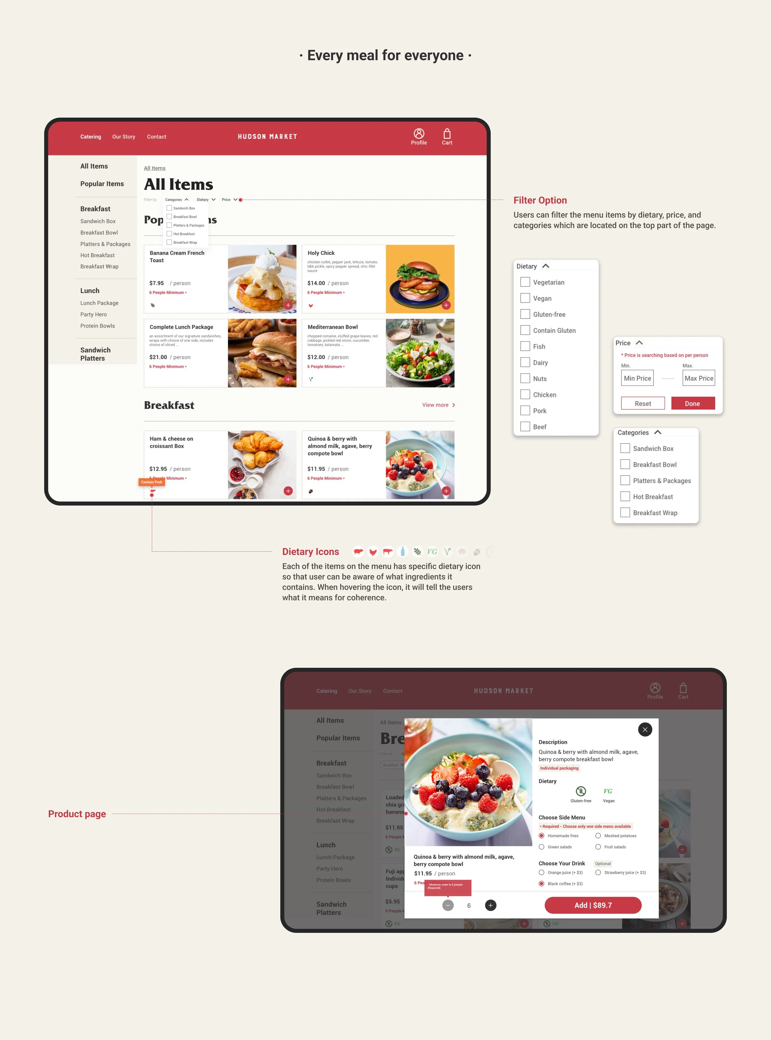
When Users enter the catering menu page, it is categorized by types of meals or cuisines to make it easily navigate. Also, they can filter the menu items by dietary restriction, price, and categories which are located on the top part of the page.
CONCLUSION
This is one of the UX projects that I’ve worked on and presented to the current company to improve the user experience with the current website. They are really impressed about it and concerned about finding a developer who can make it real. On that note, there are a few things I’ve learned. From this project, I learned how important it is to empathize with users for a successful project. The Designer can find the pain point, needs, and solution to make a better user experience. Also, Users always have the perspective that I can solve the challenge.
See More Of My Work:
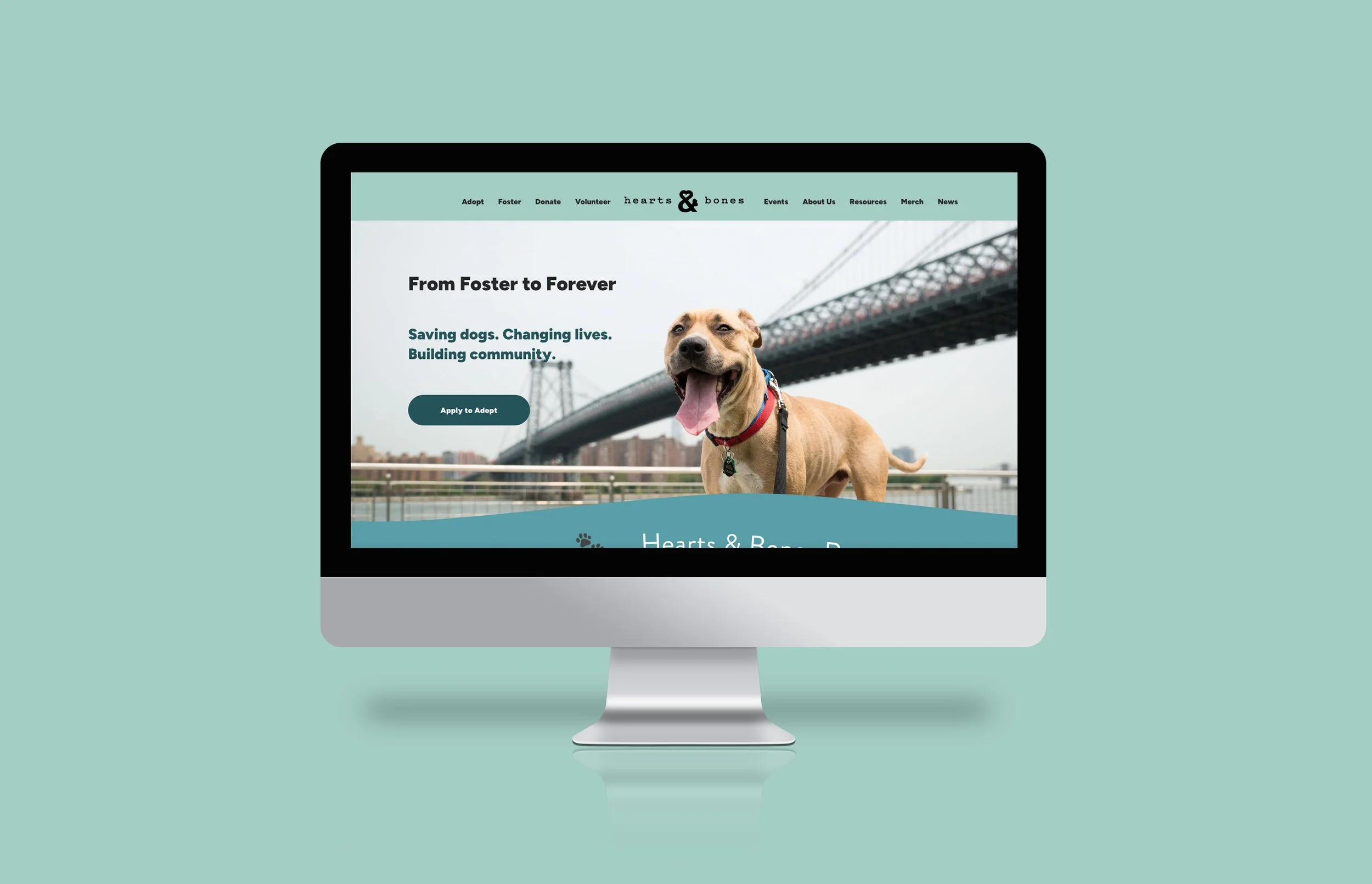
Hearts and Bones Website
Animal Rescue Organization • Web Design • Marketing
Responsive website for the organization to build up better user flows and make it easier for users to find information for adoption.
RECLE App
Sustainability • UX/UI Design • Mobile App
Recycling Pick up Service App for users to get the guideline of recycling.
